Spread Eagle Ariel
April 29, 2008 11:30 am
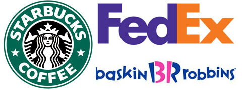
Working with logos and graphics all day, I get a great kick out of knowing how they were made, the reasoning behind them and things like that. It took me a while to figure out that the new Baskin Robbin’s logo had a thirty one in the middle of it. I think I was the last person to notice the arrow inside of the FedEx logo. But my favorite logo story is about the Starbuck’s logo.
The reason that it is relevant right now is because Starbucks is bringing back the old logo on their cups. The most obvious weird thing about it is that such a major American company would use a logo that has bare breasts on it. The full story is at DeadProgrammer.com, but the weirdest part of bringing back this logo is because it is making it obvious that the mermaid is the two finned and the story behind mermaids.
Basically, mermaids were sirens of the sea. But how can you have sex with Ariel if her bottom half is a fish? Well, skeezy sailors must have figured that sex with a mythical mermaid is more logical if it has two fins. Yep, take another look at the logo and you see that the Starbuck’s logo is holding her legs back spread eagle. Think about that next time you grab a coffee.
Categorised in: Random Posts
This post was written by Brian
3 Comments
While in no way dirty, the Big Ten logo eluded me for quite a while before figuring out that it is in fact the Big 11 and the 11 is hidden between the words. It took many a mornings running the track at practice before seeing it. Damn you Penn State.
you’re a total font nerd
As a fellow logo nerd I dig this post. There are so many good ones out there. The obvious one for us Milw folks is the old Brewers logo…but everyone already knows that one.